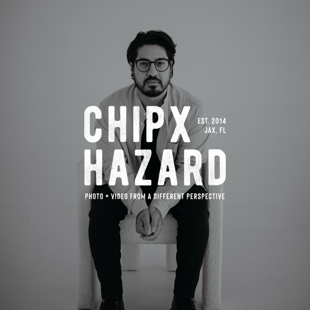
Case Study: A Brand, Website, & Copywriting Project for ChipxHazard
Client: Photographer & Videographer, Chris De LaCruz
Specializations: Wedding Films & Photography, Portraits, Commercial Films & Photography.
Desired Brand Positioning: Creative, Editorial, High-End
Location: Jacksonville, Florida.
Background:
Meet Chris, a remarkably versatile photographer and filmmaker with an extensive portfolio ranging from wedding photos & films to portraits and commercial film and photography. Married to Kara, of Kara Brooke Photography (another client of ours), they are an unmatched creative duo. With a mission to grow his audience and elevate his brand’s presence of ChipXHazard, Chris approached us with a vision for a consistent and compelling professional brand that reflected his artistry and would attract top-tier, creative clientele.
The challenge for Chris was to evolve his brand identity in a way that would resonate with a more luxury clientele, while still staying true to his unique artistic style and values.
Approach for this Brand, Website, & Copywriting Project:
In order to accomplish this together, we pursued a strategic rebranding approach that harmonized his work with a nostalgic, editorial brand.
1. Brand Identity Audit: Chris came to us with an expansive portfolio with strong visuals. Through our conversations with Chris, our team learned what he wanted out of his business’s branding. We saw immediately that Chris’s passion for people and visual storytelling shined through his work. This is what we wanted to highlight through Chipxhazard’s brand and website design.
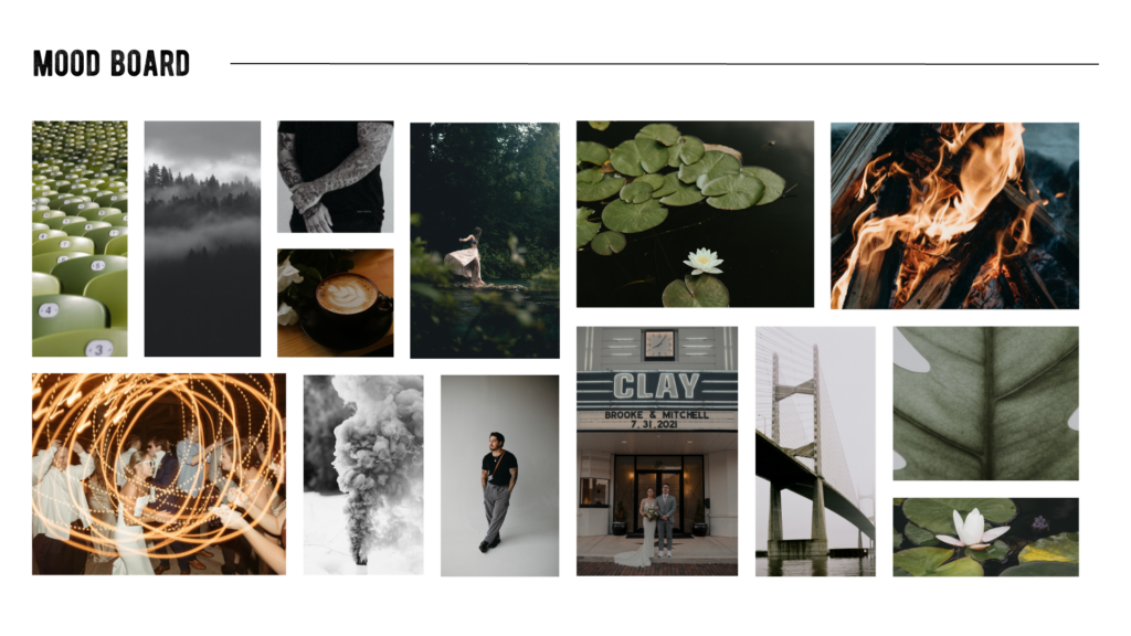
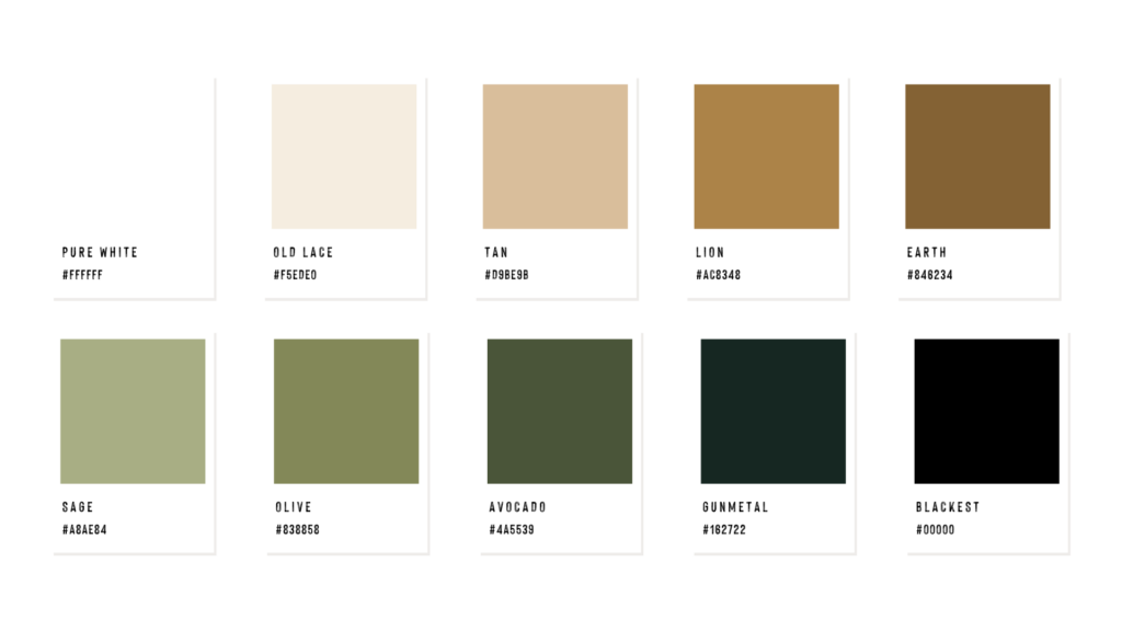
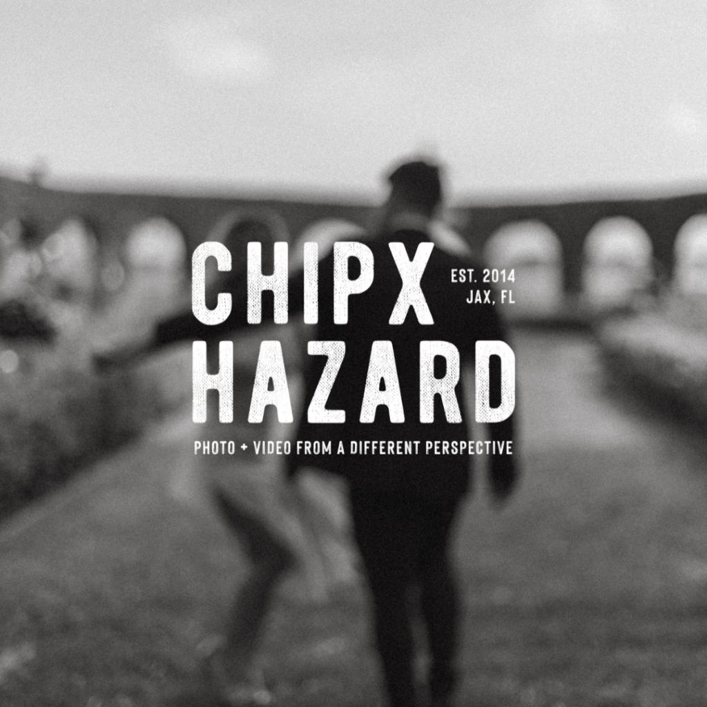
2. Design Position: We decided on a thick textured typeface to give the brand’s identity a powerful, nostalgic, and masculine look. From the very beginning, Chris wanted art incorporated with his brand. The wave art you see was heavily influenced by tattoo art that Chris gave us as inspiration. Hand drawn by our own design expert & owner, Chris Ewing.
3. Language & Communication: Based on Chris’s target audience, inspiration, and personal style, we knew that the brand messaging had to convey Chris’s inviting presences and his expertise in his industry. This gave us the tagline “Capturing stories from a different perspective”, highlighting Chris’s original eye and unique ability to tell stories through his lens. We wanted ChipxHazard’s copy to have a confident, authentic tone of voice, conveying to readers that he is an industry expert.
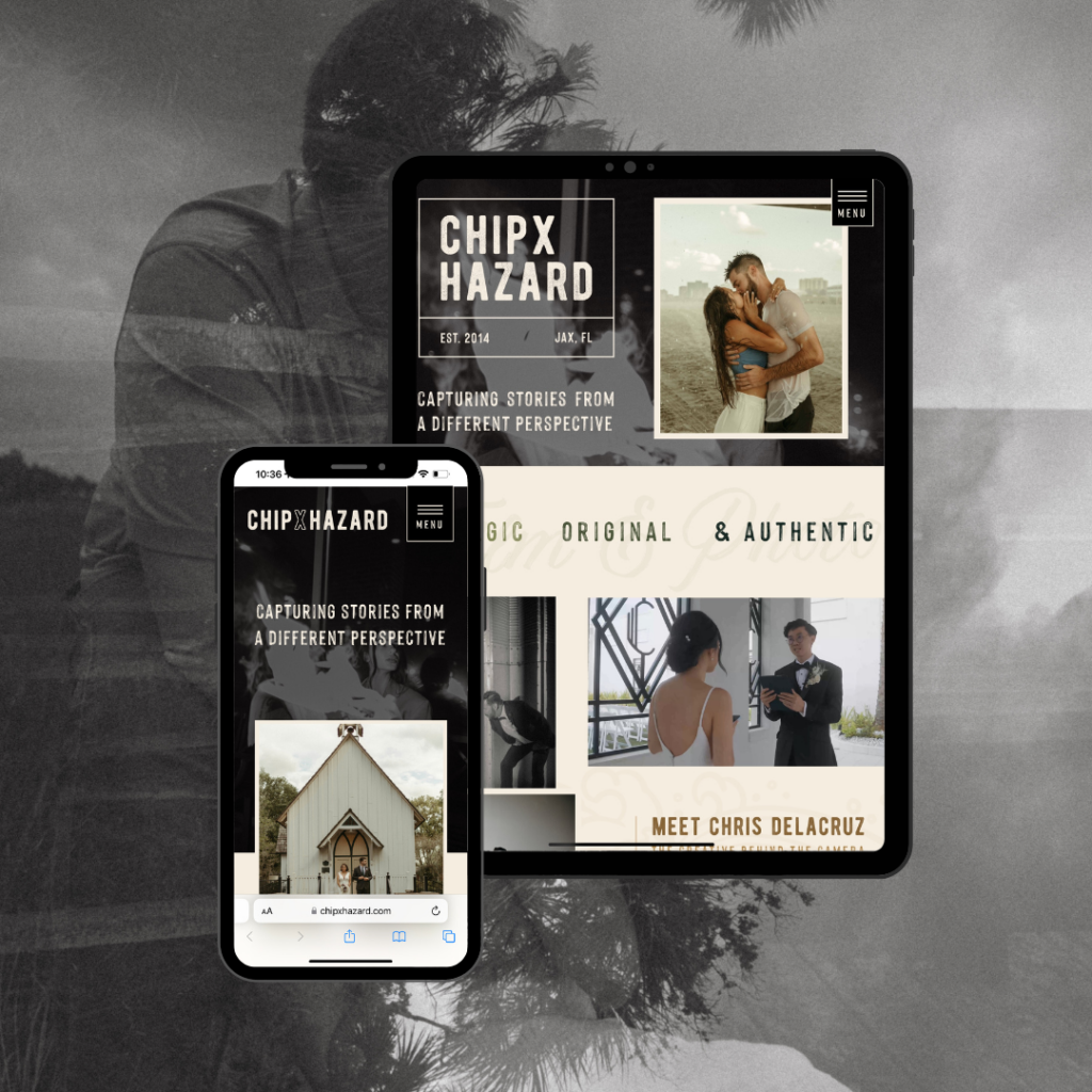
4. Website Design: The website design was heavily influenced by the brand we created for him. Inspired by the wave art, we wanted to build the website to be user-friendly but engaging to potential clients. Being sure to place brand messaging alongside Chris’s incredible work to allow the website to speak to Chris’s talent and professionalism.
Solution & Results:
By blending his artistic style with a strategic brand and website design, we were able to successfully repositioned Chipxhazard’s brand as a premium and unique photo and film service.
Through our project, we were able to deliver a product to Chris that reflects his personality and his talent. The benefits of having a consistent brand and website has positioned Chipxhazard to book higher end clientele and more of the commercial projects he desires.
In Conclusion…
This case study shows the transition of ChipxHazard’s brand into the high-end sphere while maintaining his original artistic style. This process was a huge success for our team because ultimately the client was overjoyed with the end product. This is what we do; build extraordinary brands for creative entrepreneurs. To Chris, thank you for trusting us with your business. Our team is lucky to be able to work with people like you!
To explore Chipxhazard’’s new brand identity and view their portfolio, visit https://chipxhazard.com/
