Today, we’re diving into the captivating world of color psychology and how we, as brand designers, help photographers express their unique identity and reach their target client through their brand color palette.
Colors aren’t just pretty shades on a palette; they’re powerful tools that can communicate feelings, evoke emotions, and tell a story. We know you photographers get that because you are storytellers, with your work often revolving around capturing emotions and stories in every frame. Let’s talk about how the colors we choose for branding can reflect who we are and resonate with our clients.
1. The Language of Colors: Why Colors Matter in Branding
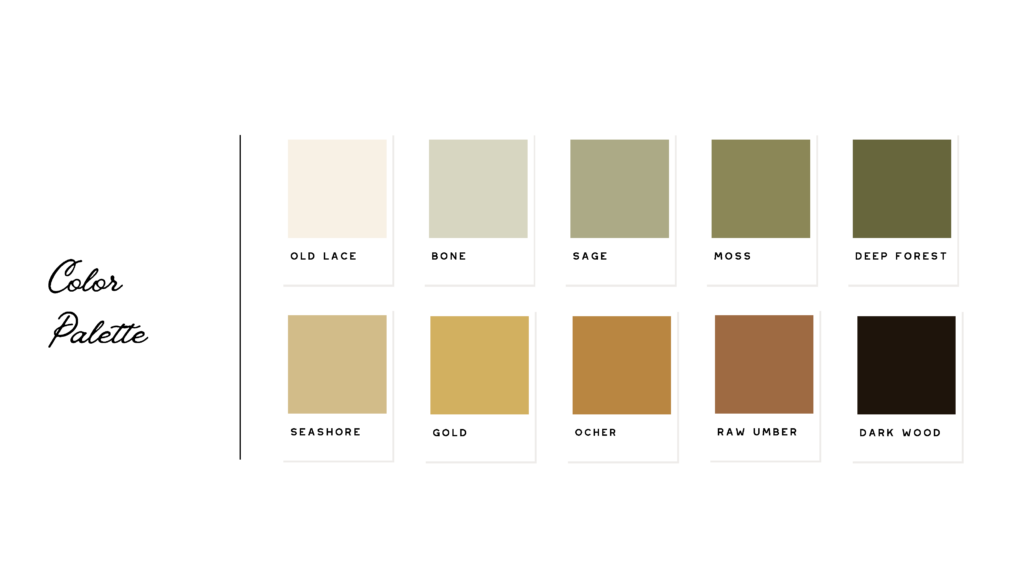
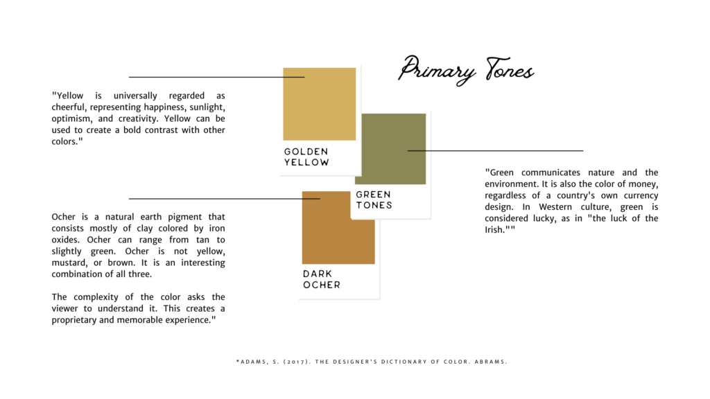
Each color carries a distinct message. For example, warm colors like red and orange can convey passion and excitement, making them perfect for photographers specializing in vibrant, high-energy photography. Meanwhile, cool tones like blues and greens offer a sense of calm and serenity. The same happens in branding; different colors used in your brand help guide your customer to put together a picture of who you are and what it would be like to work with you.
2. Authenticity Matters:
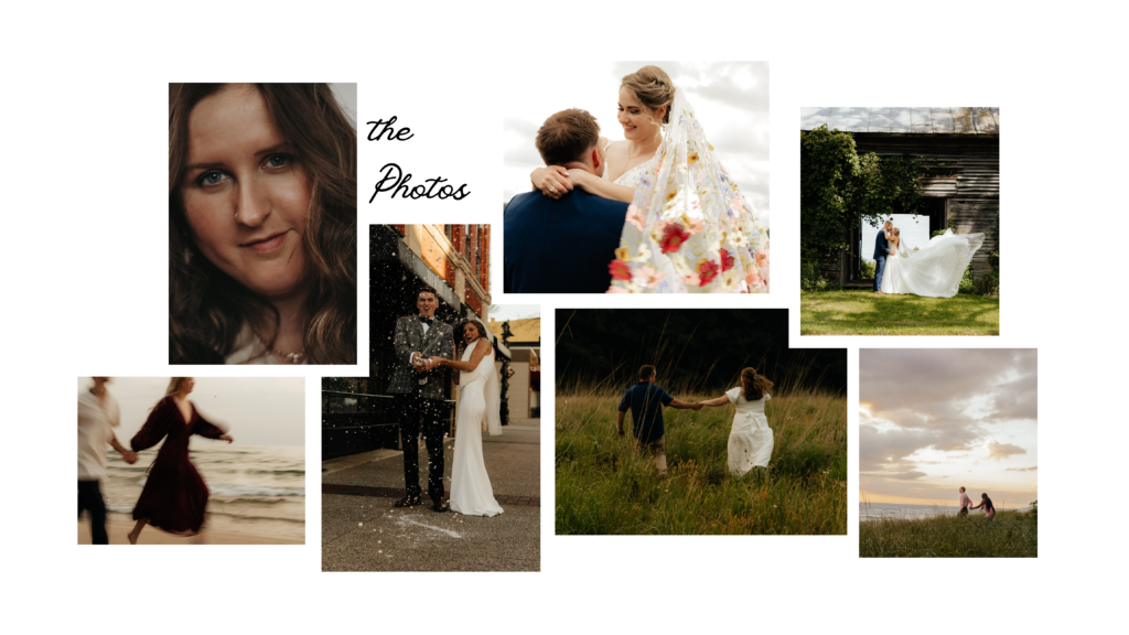
Your brand’s colors should mirror your personal style and the themes you’re drawn to in your work. If you’re a photographer who loves authentic moments, consider earthy tones like forest greens, earthy browns, and sky blues to reflect your love for the world around the subject as it is. Being authentic in your brand is important because it will attract the type of client you are looking for.


3. Consistency is Key:
Once you’ve chosen your colors, be consistent. Use them in your logo, website, business cards, and social media profiles. Consistency helps create a cohesive and memorable brand identity. When potential clients see your work, they’ll instantly recognize it as yours.
5. Add Your Brand’s Personal Touch:
Don’t be afraid to incorporate a color that’s uniquely “you.” It could be a subtle splash of your favorite color in your logo. Your brand should be a reflection of your journey as a photographer.
In conclusion, choosing the right colors for your brand as a photographer isn’t just about aesthetics but storytelling. It’s about conveying who you are and what your work represents. The colors you choose should resonate with your clients, drawing them into the world you’ve captured through your lens.
So, embrace the power of colors, be authentic, and let your brand reflect the beautiful art you create. After all, your unique perspective makes your photography stand out. Happy branding, and keep capturing those beautiful moments!
So, as you start your branding journey, keep us in mind! Here at Ivory and Green, we love taking your personality and style and making it into a brand that looks as hot as your work does and draws your ideal client in towards your business.
Here at I&G, we strive to help you grow your business, if you want to explore going through the process of building an effective brand and website that works for you, give us a ring. We are here to help you succeed.
